Jungmyung Lee
Graphic designer Jungmyung Lee (KR) is one of the WOW Artists in Residence. She presented in July her recent exhibition Dialogues in the Vertical Gallery in WOW and September 17 she will give a guided tour of her exhibition at 14:00.
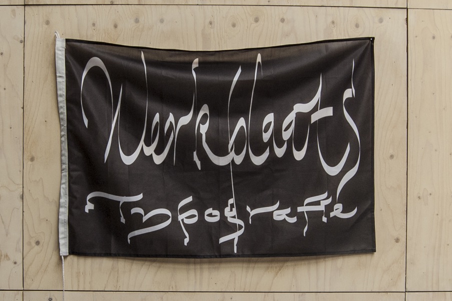
THE BEGINNING OF DIALOGUES
“During the past few years I have designed 8 to 10 different fonts, of which 5 or 6 are display fonts, which means that they are really outspoken or formal and could difficultly be used as a body text, because of their low readability. Normally, this kind of display fonts is used for headlines, where the focus is on expressing a feeling more than on readability. On the other hand, I also created more neutral fonts with a higher readability.
When I was asked to make an exhibition in the Vertical Gallery, my starting point was thinking how to use them and how to pair one neutral and legible font with a display one.
The display fonts have a story within themselves because they are very specific, they come from a very definite formal cue. So I thought it would be nice if the two different fonts would talk about how they look, or comment on each other based on their appearances, or on how they were created and such.
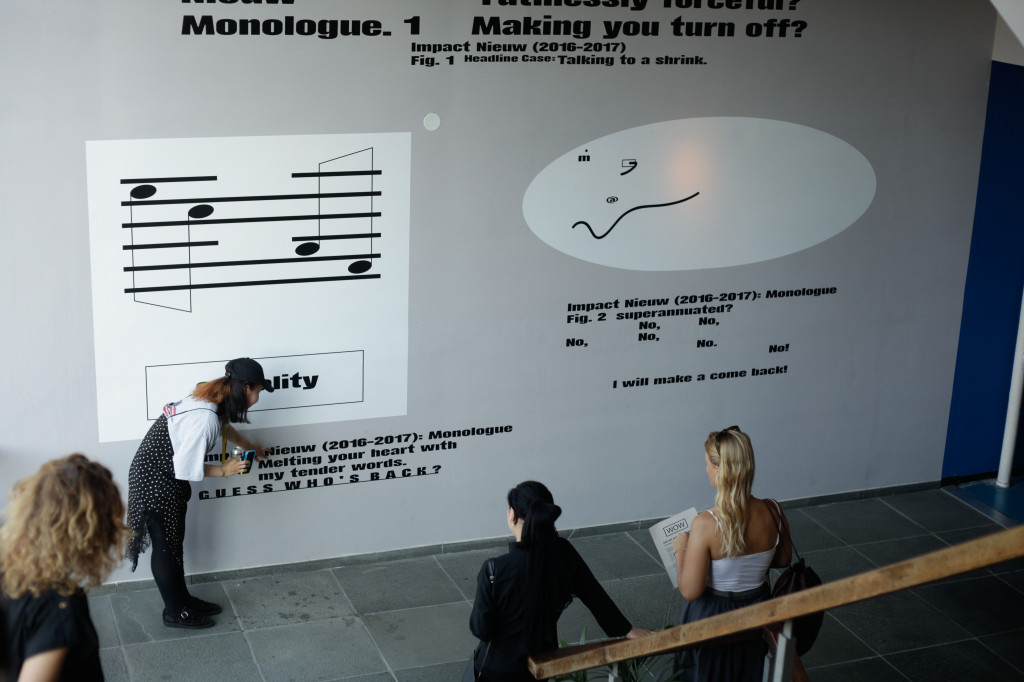
When you use a specific font or typeface, it creates a specific atmosphere. If you use the same font for one or two lines on a poster or if you use it for a whole text you would have two different perspective on it, the feeling created is different. I wanted to talk about the kind of feelings you get when the font is used as a headline case in 300 point size, or if it is used in 20 or 60 point size. I then used the walls as specimens, so that the fonts would talk in two ways, one through the headline case, and the other with the paragraph or body text case.”
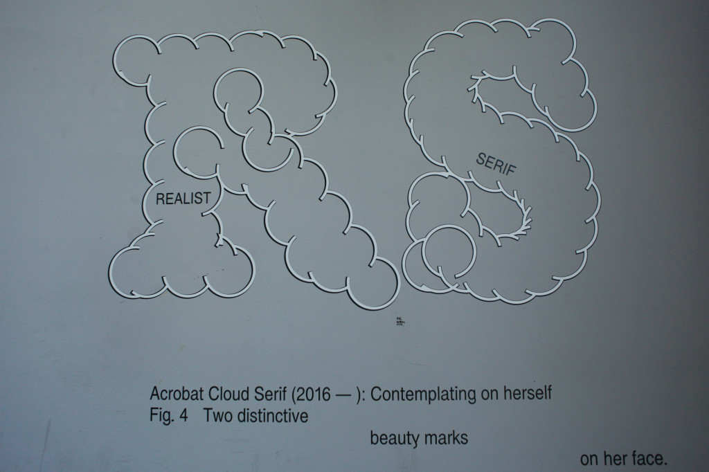
REALIST TYPOGRAPHY
“I was very interested in this kind of realist typography, a very particular field where people research about a specific form. For example, if you use a needle as a formal cue to create a typeface, and you repeat this needle form in the creation of the font, then even ‘o’ would be very sharp. It is a very straight forward way of creating fonts, you get this feeling or expression directly from the form that you take as formal cue.
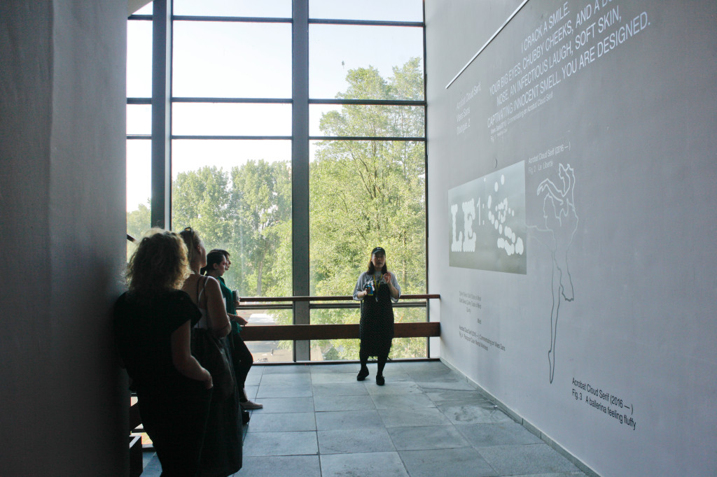
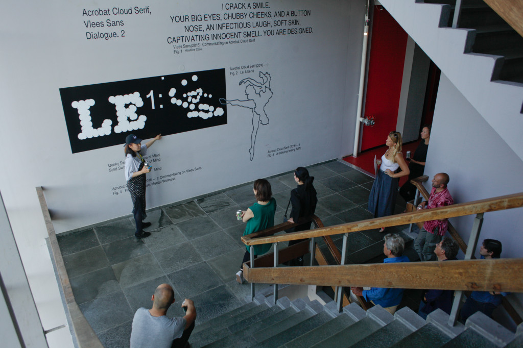
Because of this, I became interested in the expression conveyed by typefaces. It is as in music, when you listen to it and you feel the beat you get immediately a feeling of sadness or joy. Acrobat cloud serif, which is present in the exhibition, is made from that kind of research.”
PRESENTATION
“For me it is very important the way I present my fonts, and what kind of ways I take to talk about these expressions to people. So of course for me making very dry type specimen poster or book doesn’t work to transmit these kind of details. The dialogue works really well in this kind of presentation, where there are not only typefaces, but also images.
When I begun experimenting on how to talk about fonts and expressions, I tried to make hip-hop music and realized a music video, which was showed during WOW Open AIR last March. I choose hip hop because I just started Type Foundry and I liked this bombastic attitude. I wanted to say that “Hey, I’m coming to this industry now, we will turn the Type Foundry industry upside down”, with very ambitious and overblown lyrics.
To realize the song and the video I first wrote these concepts as an essay, then I contacted an hip hop lyricist and he turned the essay into hip hop lyrics, then I found a guy from Illinois who rap it for me. It was a chain of outsourcing.
And I want to do it again with the other typefaces, because there are some gothic fonts, with sharp edges, and I want to work with punk musicians to relate the feature of the font and the music.”
MORE THAN TYPE FONTS DESIGN
“I studied at Werkplaats typography in Aarnehm, which is more about design in general than graphic design, they have a long tradition and it’s very scholarly minded on letter fonts. Even if there are also a lot of people not dealing with graphic, but also with sounds or music.
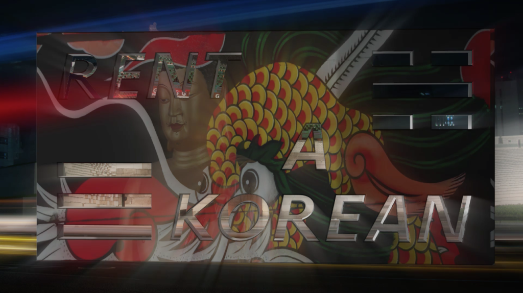
My interests, however, are broader than typography, spanning from making music to the term ‘service’. I used to do “Rent a Korean”, which meant that as a Korean person I rented myself out, and people contacted me for different ‘services’. For example once I did a performance at the Kunstverein in Amsterdam during the spring performance festival, where the curator asked me if I could do something for two hours. In other words, she rented me for a specific time and I had to do something. People think that ‘service’ as a term is very low key, but actually I believe that is a slippery feeling. Everyone is making money by doing something. Even thought in the case of an artist or designer is sort of a life long creation, you’re not doing it for nothing, you get paid for it and I think it’s simply like that. Because of this specific interest, I started do various things related to the ‘services’, and turned it into an art practice.”
OUTSOURCING
“When I made the music and the video to present my typefaces, I wanted to include outsourcing because in my practice I’ve always had to deal with outsourced jobs. So I wanted to see how it works when I outsource a project, but in this case I was the one having the big picture of it. Still you don’t know how it will go because everything goes from person to person. That’s why I found this website called Fiverr, which is a website where the people can post about something that they are good at. For example if someone is good at rapping, then he or she makes a video showing his abilities, and then someone else can contact him. In the end as an artists or designer you always have some obsessions or something you’re very good at, and you feel special about it. So through Fiverr you can offer your service in the activity or practice you’re very confident about and get paid the right fee for it. In school for example we were all asked what was our work about, our story and topic. Then people talk about their long lasting interests, research and those things are somehow reflected in their own work. For me it is about binding work with what you’re actually good at, the things that makes you different from everyone else. In my case I think I’m a good observer.”
RENT A KOREAN
“In this project, I was mainly dealing with the presumptions related to being a Korean, and all the questions that come with it about kimchi and origami, and these sort of things and to sort of fulfill the stereotype I learned to do these things myself with tutorial on YouTube or similar tools.
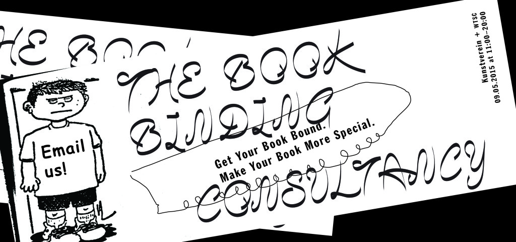
Learning to make origami, make me become very good at bookbinding and with one of my classmate we organized an book binging consultancy event. We got a space and invited people to bring in their project and consulted them on how to bind them, basically we got paid for our expertise in this field. We used this platform to offer a service and get paid at market value.”
VISUAL APPROACH
“My focus is mainly on how fonts are used in different forms and media to share emotions and feelings. I try to find different ways to presents my fonts, such as with music video, detaching myself a bit from type design. I cannot really call myself type designer because I deeply respect the people that do it, and their intense study behind their design. My study is a bit different, because I focus more on how the fonts are used in graphic design, it’s more visual than a genuine study on letter forms. I imagine how a font would look like in a specific poster, and create fonts that I would like to use, without thinking too much about readability. For some people making a music video, or displaying the fonts in the way I did it in the exhibition at WOW are byproducts of designing typefaces, but for me that is the main product, and the fonts are the key subjects.
I believe the font is a face that reflects the facial expression that the viewer makes when looking at it. For example, Antiqua would have a serious, nostalgic, sophisticated and elegant face. This effect is even greater when you use display fonts, that’s why I’m very interested in them, even if I continue to make also more neutral fonts to study more deeply typefaces.”
WOW
“Living at WOW for me generates a sort of double feeling. On one side when you graduate you want to settle down and have a more ‘normal’ life, on the other having peers around you makes you feel like you’re not alone.
The exhibition at WOW, I realized, is very special for me. Since I graduated I was thinking on the direction I was taking and I was always putting aside certain things because there were more urgent things to do. This project is for me very monumental, not only in its size, but also for its timing and because I consider it so far my best work. When I was asked to do it, I thought of hanging some poster, but I’m not a poster artist, and I don’t have a series of poster. The staircase environment invites also for a dialogue between the different walls.
In these situations, you really need to dig to find something, try new formats and challenge yourself. It was a very interesting time for me. I used 8 typefaces that were already in my own archive box, but that I never used and I didn’t know how to use them. And now I’m happy they don’t sit in a box anymore.”
FURTHER APPROACH
“What I did here was an interesting turning point in my work. Someone suggested me to make a book out of this, and use the walls I designed as a sort of excerpts of the bigger story. Here I wanted to create these kind of images with typefaces, but they are sometimes very specific and in some cases you need to know some backgrounds. So it would be nice for me to make a little book with it and add a longer version of these stories.”
Dialogues is on view in the Vertical Gallery in WOW until September 18.
Check out more of Jungmuyng’s work on her website.
by WOW
I believe the font is a face that reflects the facial expression that the viewer makes when looking at it. For example, Antiqua would have a serious, nostalgic, sophisticated and elegant face.